Discover the fascinating journey of *Never Use Futura* by Douglas Thomas—a must-read for design lovers and curious minds alike. Explore Futura’s impact on culture, branding, and beyond in this engaging, insightful book review.
Never Use Futura by Douglas Thomas
Why would a whole book be devoted to a single typeface, you might ask yourself when you first start reading *Never Use Futura*. Douglas Thomas swiftly allays any reservations, though, and leads readers on an engrossing voyage that delves deeply into cultural, historical, and creative realms in addition to the fundamentals of typography. *Never Use Futura* examines not only the font but also the development of visual culture, design aesthetics, and the ability of a single typeface to impact everything from avant-garde art to political propaganda. Let’s explore Thomas’s genius and discover why, even if you’re not an expert in typography, this book is worth reading.
What’s the Big Deal with Futura?

Douglas Thomas makes a strong argument for why Futura is more than merely a typeface. German designer Paul Renner combined his love of geometry and his drive for simplicity to develop it in 1927. Renner wanted to create a “modern” typeface with simple, nearly universal design, balanced curves, and crisp lines. According to Thomas, Futura came to symbolize development, inventiveness, and the attitude of optimism of the early 20th century.
Breaking Down the Book: Key Themes in *Never Use Futura*
The design book *Never Use Futura* is not like the others. The book is enlightening and enjoyable to read because of Thomas’s humor, knowledge, and regard for his topic. Thomas explores the following major subjects in the book:
1. The Historical Journey of Futura
Thomas delves further into the history of Futura, describing how it began during the Bauhaus, when function and geometry were key components of design. He demonstrates how Futura’s angular, geometric design was groundbreaking for its day and how it contrasted with the ostentatious typefaces that were common in the early 1900s. It evolved into a tool that connected traditional and modern design, a representation of modernity and practicality.
2. Futura in Pop Culture
Thomas’s examination of the font’s unexpected presence in popular culture is arguably the most entertaining aspect of *Never Use Futura*. From the *Vogue* logo to Stanley Kubrick’s *2001: A Space Odyssey*, the typeface has been used everywhere. Actually, Futura has been the typeface of choice for projects that want to create a feeling of modernity and refinement. It’s a typeface that’s ageless without being dated and serious without being stuffy.
3. The Global Influence of Futura

Examining Futura’s worldwide influence is one of the book’s most fascinating portions. Thomas explains how Futura arrived in the US during World War II, established itself as a standard in American design, and even came to rest on the moon. The Apollo 11 plaque that NASA famously placed on the moon, which says, “Here men from the planet Earth first set foot upon the Moon, July 1969,” features Futura. Futura’s reputation as the “font of space” was cemented by this usage, which further strengthened its hold on American culture.
4. Futura’s Role in Branding and Politics
Thomas also touches on how Futura has been used in branding for major corporations, such as Volkswagen and Supreme. Futura is a brand’s dream font—modern, sleek, and widely recognizable. And on the political spectrum, it has been used in campaign materials, demonstrating how typefaces can communicate specific ideas and influence public perception.
5. The “Never Use Futura” Debate
The book’s title, *Never Use Futura*, might sound contradictory given the book’s admiration for the font. Thomas tackles this tongue-in-cheek phrase by exploring why Futura can sometimes be overused or misused in ways that dilute its impact. He explores the backlash against Futura’s near-ubiquity and explains why, in certain contexts, designers might want to rethink their automatic reliance on this famous font.
Why Should You Read *Never Use Futura*?

While *Never Use Futura* is filled with fascinating information, Thomas’s writing style is what makes the book such a great read. He writes with a conversational tone, making the subject approachable even if you’ve never considered the impact of typefaces before. Thomas finds humor in the details, pointing out how Futura has been used in everything from minimalist movie posters to fast-food signs. For design lovers and casual readers alike, *Never Use Futura* is packed with insights that go beyond fonts to comment on society, art, and culture.
An Inside Look at Typography and Design Culture
*Never Use Futura* will seem like a behind-the-scenes look at typography if you’re interested in the design industry. Thomas investigates the effect of the Bauhaus movement on design and delves into the work of the font’s inventor, Paul Renner. Intriguing information about other typefaces, such as Helvetica and Times New Roman, is also covered in the book. It explains how Futura differs from these other fonts and why Futura is unique in the wide world of typography.
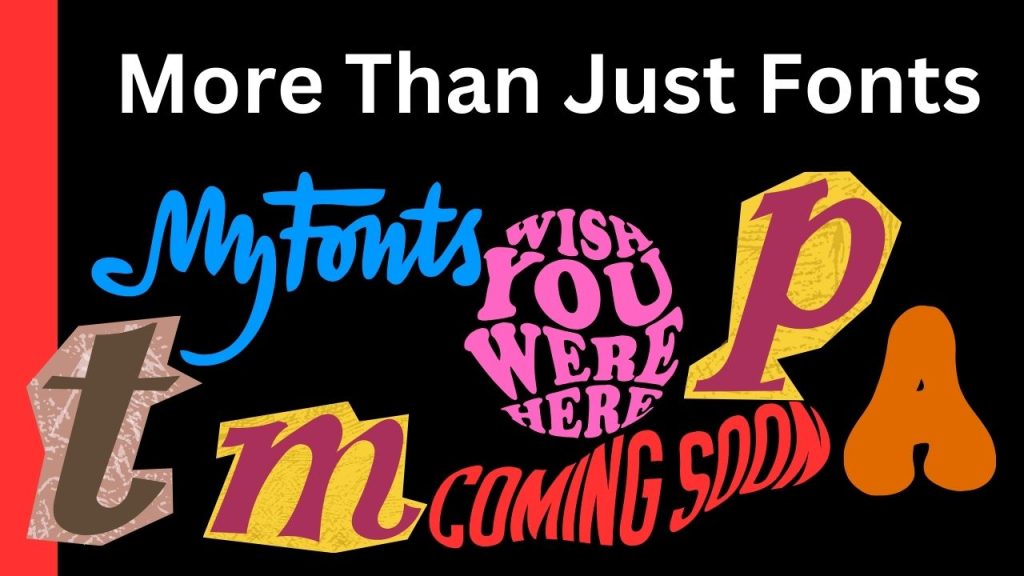
More Than Just Fonts: A Cultural Commentary

Thomas’s book offers an unexpected bonus: a sharp commentary on culture. From analyzing how fonts are used in media to examining how political campaigns employ fonts to sway public opinion, *Never Use Futura* paints a bigger picture. Thomas reveals that design decisions, including typography, are far from random—they’re strategic choices that have shaped everything from advertising to social movements. It’s a reminder of the power of design and how fonts can quietly influence us every day.
An Ideal Book for Designers and Non-Designers Alike
*Never Use Futura* offers something for everyone, whether you’re an artist, graphic designer, or just interested in the backstories of commonplace items. Douglas Thomas transforms what may have been a dull, specialized topic into an artistic, cultural, and historical voyage. You don’t need to be a designer to understand his ideas; Thomas makes his explanations interesting and easy to understand, drawing readers into the rich world of type.
Final Thoughts: Why *Never Use Futura* is More Than Just a Book About a Font
The book *Never Use Futura* is as fashionable as its theme. It brings the book to life with its abundance of examples, images, and a love of storytelling. In addition to exploring Futura’s lengthy history, Thomas’s work seems to be a celebration of design and an encouragement for readers to adopt a more critical perspective on the world. You will have a fresh perspective on every street sign, advertisement, and billboard by the conclusion of the book. Typography has a profound impact on our world.
Where to Get *Never Use Futura*
Are you prepared to explore the intriguing world of Futura? (insert particular link here) Douglas Thomas’ *Never Use Futura* is available on Amazon.com. This book will give you a fresh perspective on typefaces and how they affect our lives, regardless of your level of expertise as a designer or as a reader.


